Hey Sam, from your first video, I think you could slower it down slightly a bit when the words comes out. I didn't had the time to finish reading the whole thing. And it's looking good btw :)
A piece of advice - I'm finding it hard to feedback on your work due to your blog/ size of videos....Simply put it feels unloved...When you get chance tidy it all up....Its a mashup of so much graphically at the moment that its not doing your work justice. To compound matters you also post your movies at the smallest size? Yes people can watch them on Youtube but thats not helpful for the viewer, what the blog is for, or very professional. For example change the following...
1) Lose/ change the 'splat' background. Its competing with your work. Use a simple colour instead. 2) Choose one font for your blog - the post title, the buttons/tabs, the date, the title bar are all different. 3) Reduce the size of your font - Particularly the post title and button / tabs. 4) Change your title bar (Sam Cannon) - Your current one is pixelated and doesn't fit your format (width) 5) Change the size of the videos so they use more of the space.
NOTE: Remember that your blog is public facing and its purpose is to show off your work to the world. At the moment yours feels like you're trying to hide your work not show it.


Hey Sam, from your first video, I think you could slower it down slightly a bit when the words comes out. I didn't had the time to finish reading the whole thing. And it's looking good btw :)
ReplyDeleteThanks :) Yeah I think I may be able to slow it down on Premiere Pro.
DeleteHI Sam
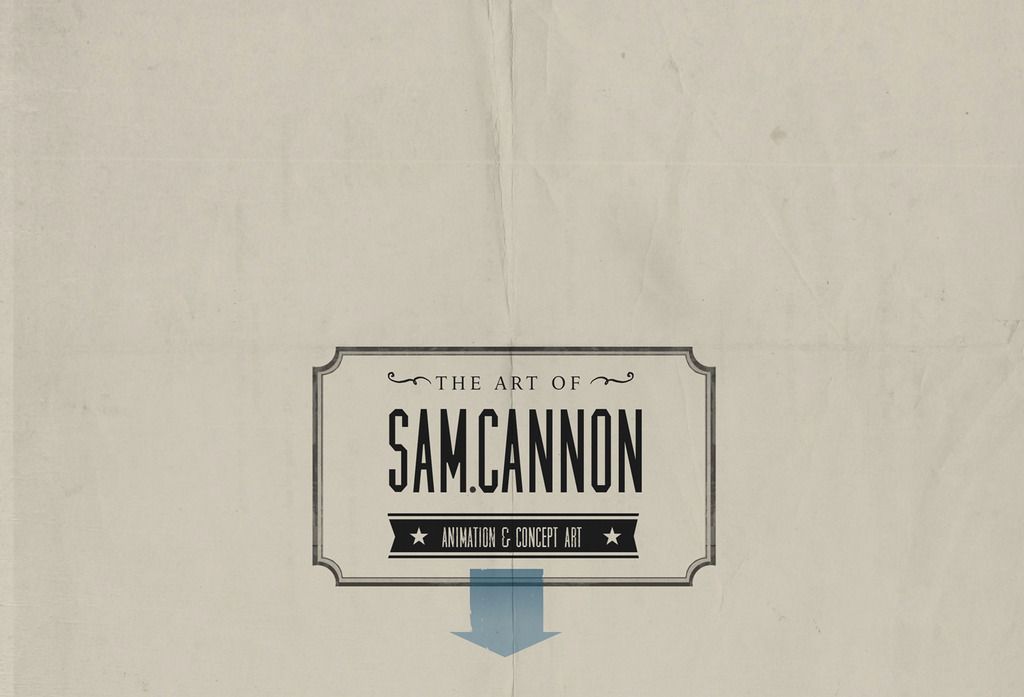
ReplyDeleteA piece of advice - I'm finding it hard to feedback on your work due to your blog/ size of videos....Simply put it feels unloved...When you get chance tidy it all up....Its a mashup of so much graphically at the moment that its not doing your work justice. To compound matters you also post your movies at the smallest size? Yes people can watch them on Youtube but thats not helpful for the viewer, what the blog is for, or very professional. For example change the following...
1) Lose/ change the 'splat' background. Its competing with your work. Use a simple colour instead.
2) Choose one font for your blog - the post title, the buttons/tabs, the date, the title bar are all different.
3) Reduce the size of your font - Particularly the post title and button / tabs.
4) Change your title bar (Sam Cannon) - Your current one is pixelated and doesn't fit your format (width)
5) Change the size of the videos so they use more of the space.
NOTE: Remember that your blog is public facing and its purpose is to show off your work to the world. At the moment yours feels like you're trying to hide your work not show it.
ReplyDelete